
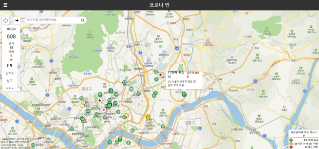
A screenshot of Coronamap Live taken on Feb. 24, 2020, shows an interactive map with information on coronavirus patients and places they have visited. (Yonhap)
SEOUL, Feb. 24 (Korea Bizwire) — Digital maps are helping South Koreans keep track of COVID-19 amid a deluge of information on the contagious virus as the number of patients are increasing by the hundreds.
South Korea’s infections remained relatively stable until mid-February. The total number of patients hovered around 30 and even remained unchanged for several days.
But the situation took a nasty twist after a church in the southeastern city of Daegu emerged as a hotbed of the virus. In the past week, the number of patients swelled explosively, bringing the total to 763.
As patients were confirmed in different corners of the country, including more than 20 in the country’s capital, keeping track of the latest information has become important than ever.
Some digital tools are helping people locate patients near their houses or workplaces and stay updated on the latest news.
Coronamap Live (https://coronamap.live/), provided in Korean, English and Chinese, is one of them.
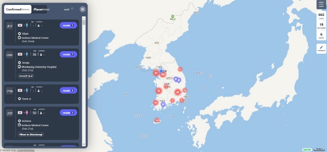
The interactive map shows the patients’ information, including their residence, nationality and gender. It also shows where they are hospitalized and how many people they have contacted.
As demand for the interactive map became high, developer Ryan Hong also set up a separate newsfeed called Corona Live (https://corona-live.com/), which curates the latest headlines and links them to news sites.
A screenshot of Corona Map taken on Feb. 24, 2020. (Yonhap)
Some other digital tools that track the coronavirus outbreak are Corona Map (https://coronamap.site/) and Corona Nearby (https://corona-nearby.com/).
Corona Map shows places that patients have visited and how many people they have affected.
It uses different colors — green, yellow and red — to show the risks of visiting those venues.
A red circle means that a patient visited the place less than 24 hours ago, while a yellow circle and green circle mean that up to eight days or more than nine days have passed, respectively.
Corona Nearby allows users to enter their location and see affected venues in the vicinity. By shifting mode, users can also see the information of hospitals and health centers that potential patients can visit.
A real-time board that curates a variety of information related to the new coronavirus is also trending. The site uses the domain Wuhanvirus.kr, referring to the central Chinese city where the virus first emerged.
Using government and academic data from South Korea, China and the United States, as well as the World Health Organization, the site displays suspected and confirmed cases locally and globally.
Also included on the website are information of the confirmed patients as well as the latest news and YouTube videos on the outbreak.
It also compares figures from the new coronavirus outbreak to other contagious diseases, such as the Middle East Respiratory Syndrome and Severe Acute Respiratory Syndrome.
(Yonhap)


