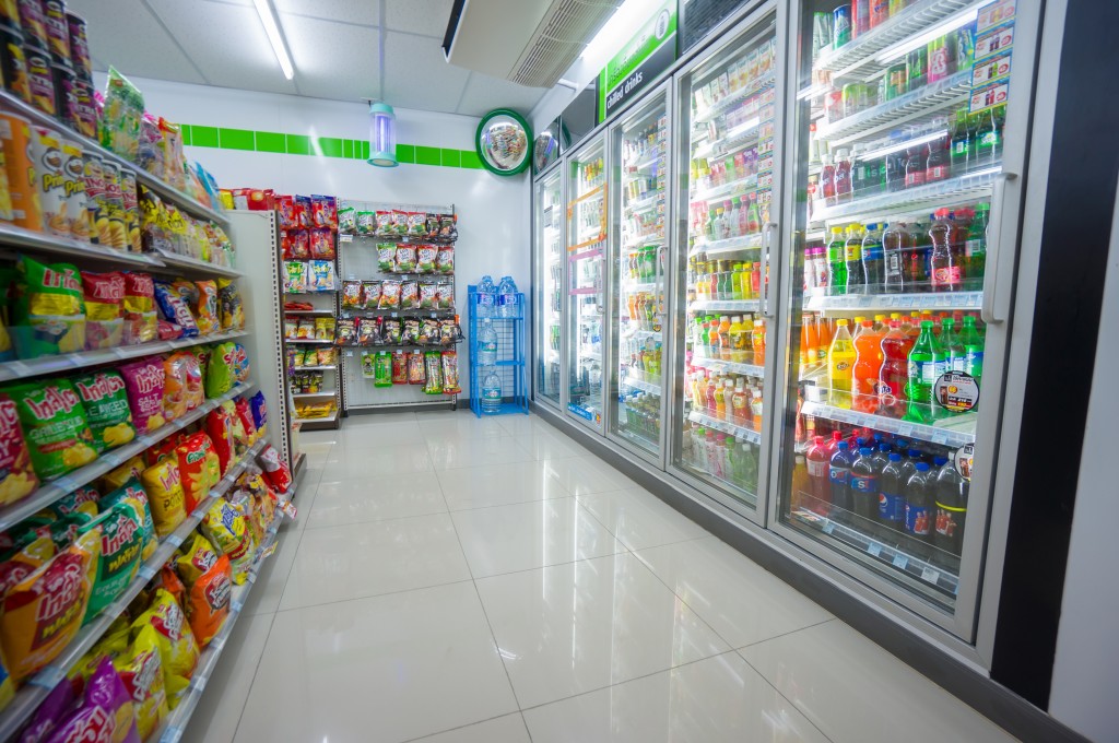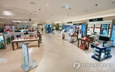
Despite the depressed distribution industry and a nationwide economic slowdown, convenience stores and mobile shopping sites are showing double digit growth. (Image : Aleph Studio / Shutterstock.com)
SEOUL, March 3 (Korea Bizwire) – While the retail sector in general is going through tough times amid the economic slowdown, convenience stores and online shopping websites — especially those dedicated to mobile users — are weathering the storm, with consistent double digit growth rates. Not surprisingly, there is a secret to their ability to outperform the traditional retail industry, according to a report by Maeil Business News Korea.
Being compact and agile have been keys to success for both of these high-performing retailers. Convenience stores are smaller in size compared to discount stores, and mobile phones are much smaller than a PC screen.
According to industry analysts, these ‘small’ distribution channels have a special way of ‘stocking’ in order to efficiently use their small space and obtain good results.
Convenience store shelves are designed with specific functions in mind. Considering the small space in convenience stores, the shelves are shaped as trapezoids. Since the shelves get wider as they get closer to the bottom, consumers can see the stocked items easily without having to make the effort of squatting down in the middle of a narrow aisle.
Beverages, alcohol, dairy products and ATMs are located in the deep end, which is further from the door. Since these products are responsible for the majority of sales (except cigarettes), the location forces customers to look around at other products while they head to the back of the store.
However, cigarettes are displayed behind the counter. They represent 40 percent of total convenience store sales, but since they are expensive compared to other products, they need ‘special treatment’.
A similar principal is applied on mobile shopping sites. The location of the ‘purchase’ button is the most noticeable change. While the purchase button is on the left side at most internet shopping sites, it is on the right side on mobile sites. Usually, important information is located on the left side, as our eyes naturally move from left to right. However, on mobile, the movement of the thumb is far more important.
Officials from the online shopping site 11st explain that if the purchase button is on the left side, customers have to ‘stretch out’ their thumbs – i.e. ‘make an extra effort’ – to make a purchase. However, important information such as the price and discount rate is still displayed on the left side.
In addition, instead of posting many product images like the days of PC shopping, mobile shopping sites offer a rectangular image that fills the screen. Since the screen is smaller, instead of distracting the customer with multiple images, one strong image of the product is displayed.
As mobile shopping has settled as the ‘it trend’ of shopping, industry watchers comment that the principles of mobile display are being applied to PC shopping sites as well. They comment that mobile shopping malls followed trends set by PC sites, but now the situation is reversed as mobile shopping has become more popular.
By Francine Jung (francine.jung@kobizmedia.co.kr)


